
Entertainment
Big brother magazine: 7 Powerful Lessons from a Rebel Skateboarding Icon
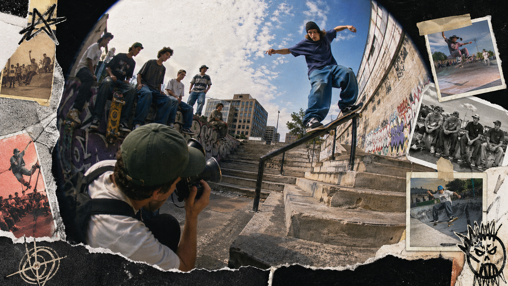
Big brother magazine was an American skateboarding publication founded in 1992 by Steve Rocco. It became known for its loud voice, street-skate focus, strange design choices, and wild sense of humor. The magazine stopped publishing in 2004, but its impact still shows up in skate media, internet humor, video culture, and the rise of shows like Jackass.
What Made the Magazine Different?
Most sports magazines try to look clean, safe, and polished. This one did the opposite. It leaned into the messy side of skateboarding: jokes, inside stories, strange layouts, unusual photos, and a feeling that readers were part of an underground club.
At the time, skateboarding was not as mainstream as it is today. Many skaters felt misunderstood by schools, brands, parents, and traditional sports media. The magazine spoke to that feeling. It did not present skateboarding as a neat hobby. Instead, it showed it as a lifestyle full of friends, road trips, tricks, arguments, art, music, and attitude.
That raw tone became its biggest strength. Readers could tell that the people making the magazine were close to the culture. They were not writing from the outside. They were part of the scene.
The 1990s Skateboarding Scene
The early 1990s were a major turning point for skateboarding. Street skating was growing fast. Instead of only riding ramps or pools, skaters were using stairs, handrails, curbs, benches, schoolyards, and city spots. This changed the look and sound of skate culture.
Brands like World Industries helped push this new energy. Steve Rocco, who founded the magazine, was already known for challenging the old skate industry. According to SurferToday’s history of the magazine, Rocco wanted a publication that felt free from the limits of traditional skate media.
Steve Rocco and World Industries
Steve Rocco’s role matters because he understood that skateboarding was not only about tricks. It was also about identity. Young skaters wanted brands, graphics, videos, and magazines that felt like them.
World Industries was already changing skateboard graphics and advertising. The magazine became another tool for that same rebellious spirit. It gave space to voices that were funny, strange, bold, and sometimes hard to control.
Why Traditional Skate Media Felt Limited
Traditional skate magazines were important, but they often looked more professional and careful. This created room for a new kind of magazine. Readers wanted something rougher and more direct. They wanted jokes, honesty, and personality.
That gap is where the magazine found its power. It was not trying to please everyone. In fact, part of its identity came from the fact that some people loved it while others strongly disliked it.
The Magazine’s Editorial Style
The magazine’s style was loud, sarcastic, and unpredictable. It mixed skate photos with strange articles, fake-serious features, unusual art, and risky humor. Its voice felt closer to a zine than a normal newsstand magazine.
RogerEbert.com described the documentary Dumb: The Story of Big Brother Magazine as a look at a 1990s publication that treated skateboarding culture as more than tricks or board graphics, while also noting its connection to the later creation of Jackass.
Design Experiments and Packaging Ideas
One reason old issues are remembered today is their creative packaging. Some issues used unusual sizes, special extras, or playful presentation. SurferToday notes examples such as trading cards, spiral binding, multiple covers, and even a cereal-box-style issue.
These ideas made the magazine feel like an object, not just something to read. That matters for collectors. A normal issue might be interesting, but a strange-format issue can feel like a piece of skate history.
Controversy and Public Reaction
The magazine was controversial. Some shops did not want to carry it. Some adults saw it as too reckless. Some readers saw it as honest and funny. That split reaction became part of its legend.
For a younger audience today, the best way to understand it is this: the magazine pushed boundaries in a way that would be heavily questioned now. Some parts of its humor aged badly. Some parts helped open the door for more honest, creator-driven media. Both things can be true at once.
How It Changed Skateboarding Media
Before social media, magazines had huge influence. They shaped what tricks mattered, which skaters became known, what brands looked cool, and how scenes were remembered.
This magazine helped move attention toward personality. It made writers, photographers, artists, editors, and video makers feel almost as important as sponsored skaters. That was a big deal. It showed that skateboarding media could be more than contest results or perfect photos.
Writers, Artists, Photographers, and Skaters
People connected to the magazine included names like Jeff Tremaine, Sean Cliver, Dave Carnie, Rick Kosick, and others. Several later became important in film, television, art, and skate media.
This is one of the biggest lessons from the magazine’s story: creative scenes are built by groups, not just one person. A magazine can become a launchpad when it gives talented people room to experiment.
Big brother magazine and Pop Culture
The magazine’s influence reached beyond skateboarding. It helped shape a type of comedy and video style that became more visible in the 2000s. KQED notes that one of the clearest things to come from the magazine’s world was Jackass, the MTV show connected to several people from that scene.
The Road Toward Jackass
The connection to Jackass is important because it shows how print culture moved into video culture. The magazine did not stay on paper. Its people made videos, built characters, and created a style that later reached television.
Rotten Tomatoes describes the 2017 documentary Dumb: The Story of Big Brother Magazine as covering the history of a boundary-pushing skate magazine that helped spawn MTV’s Jackass and influenced a generation of skaters.
Why Its Legacy Still Matters
Today, many creators use the same basic idea: build a strong voice, speak to a niche audience, and make content that feels personal. You can see this in YouTube channels, indie magazines, skate edits, podcasts, and small streetwear brands.
The tools have changed, but the lesson is the same. A strong identity can travel far.
Timeline: 1992 to 2004
| Year | Moment | Why It Matters |
|---|---|---|
| 1992 | Magazine founded by Steve Rocco | Start of a major underground skate publication |
| Mid-1990s | Street-skate voice grows | Becomes known for raw humor and unusual design |
| 1997 | Sold to Larry Flynt Publications | Gains a new publishing structure |
| 2000s | Influence spreads into video and TV culture | Helps connect skate media to mainstream entertainment |
| 2004 | Publication ends | Print run closes, legacy continues |
SurferToday reports that Larry Flynt Publications finalized the purchase in March 1997 and that the magazine closed in 2004.
Collector’s Guide
Old issues are now interesting to collectors, skaters, designers, and pop-culture fans. The most valuable copies often have strong condition, complete inserts, rare packaging, or famous covers.
When checking an issue, look for:
| Feature | Why It Matters |
|---|---|
| Complete pages | Missing pages reduce value |
| Original inserts | Extras can make an issue rarer |
| Clean spine | Better condition helps collectors |
| Unusual packaging | Special-format issues stand out |
| Provenance | A known source can add trust |
Ethical Collecting Tips
Buy from trusted sellers, ask for clear photos, and avoid overpaying just because an issue is old. Also, preserve the magazine carefully. Keep it dry, flat, and away from direct sunlight.
7 Powerful Lessons from the Magazine
- A clear voice beats a safe voice. People remember content that sounds real.
- Niche audiences can become powerful. Skateboarding was smaller then, but deeply loyal.
- Design matters. Strange packaging helped issues stand out.
- Community builds culture. Writers, artists, skaters, and photographers all shaped the brand.
- Print can influence video. The magazine’s world helped lead into TV and documentary culture.
- Controversy needs responsibility. Pushing limits can attract attention, but it can also age poorly.
- Legacy comes from originality. The magazine is still discussed because it felt different.
FAQs
What was Big brother magazine?
It was a 1990s American skateboarding magazine known for street-skate culture, raw humor, unusual design, and strong links to later pop culture.
Who founded it?
Steve Rocco founded the magazine in 1992.
When did it stop publishing?
It stopped publishing in 2004.
Was it only about skateboarding?
No. Skateboarding was the base, but the magazine also covered personalities, jokes, art, road culture, and underground media.
How was it connected to Jackass?
Several people and ideas from the magazine’s video culture helped lead toward Jackass. RogerEbert.com and KQED both discuss the magazine’s role in that larger pop-culture path.
Is there a documentary about it?
Yes. Dumb: The Story of Big Brother Magazine is a 2017 documentary directed by Patrick O’Dell. Rotten Tomatoes lists it as a 1 hour 19 minute documentary released for streaming on June 3, 2017.
Conclusion
Big brother magazine was more than a skate magazine. It was a loud, messy, creative snapshot of 1990s skate culture. It helped street skating feel more personal, gave creative people room to experiment, and influenced the kind of video-driven humor that later reached mainstream TV.
Its story also comes with a clear warning: bold media can inspire people, but it should still be thoughtful. The best lesson for today’s creators is not to copy the controversy. It is to copy the courage, originality, and deep connection to a real community.

The topic of DJ Raphi net worth has attracted growing interest among music fans and industry followers. As DJs continue to gain recognition as influential entertainers and entrepreneurs, many people are curious about how successful artists earn their income and build their wealth. DJ Raphi is one such personality whose career has sparked discussions about his achievements, popularity, and financial growth.
Over the years, DJ Raphi has developed a reputation through his performances, music projects, collaborations, and presence within the entertainment industry. While exact financial figures are not always publicly available, examining his career path and revenue streams provides valuable insight into the factors that contribute to his overall wealth.
This article explores DJ Raphi’s background, professional journey, income sources, lifestyle, and the factors influencing DJ Raphi net worth.
Who Is DJ Raphi?
DJ Raphi is recognized as a music professional known for creating engaging performances and connecting with audiences through his unique musical style. Like many modern DJs, he has leveraged digital platforms, live performances, and networking opportunities to establish a recognizable presence in the music scene.
The rise of streaming services and social media has allowed artists like DJ Raphi to reach audiences beyond traditional venues. This expanded visibility has played a significant role in helping DJs develop personal brands and generate additional revenue opportunities.
Early Life and Passion for Music
Every successful artist begins with a passion for music, and DJ Raphi’s story is no exception. His interest in music reportedly developed at an early age, inspiring him to learn about sound production, mixing techniques, and live entertainment.
Many DJs spend years refining their skills before gaining recognition. Through practice, dedication, and continuous learning, DJ Raphi gradually built the technical abilities needed to perform professionally.
The early stages of a DJ’s career often involve:
- Learning music production software
- Understanding sound engineering
- Performing at local events
- Building industry connections
- Developing a unique musical identity
These foundational experiences often contribute significantly to long-term success.
Career Growth and Professional Development
When discussing DJ Raphi net worth, it is important to consider the professional milestones that helped shape his career.
Like many artists in the entertainment industry, career growth typically occurs in stages. Initial performances may begin at smaller venues before expanding to larger events and broader audiences.
Professional development often includes:
Live Performances
Live performances remain one of the most important aspects of a DJ’s career. Events, clubs, festivals, and private functions provide opportunities to showcase talent while generating income.
As audience demand increases, artists can often command higher performance fees and secure more prestigious bookings.
Music Production
Producing original tracks can significantly enhance a DJ’s reputation. Successful releases help build credibility and attract listeners worldwide.
Music production may include:
- Original singles
- Remixes
- Collaborative projects
- Album releases
- Digital music distribution
Each successful release can contribute to both popularity and revenue.
Brand Building
Modern entertainers must also focus on branding. Social media platforms allow DJs to interact directly with fans, share content, and promote upcoming events.
A strong online presence can lead to additional business opportunities, sponsorships, and partnerships.
Main Sources of Income
Understanding DJ Raphi net worth requires examining the various ways DJs generate earnings.
Performance Fees
One of the primary income sources for professional DJs comes from live performances.
Fees vary depending on factors such as:
- Popularity
- Event size
- Venue location
- Audience capacity
- Industry reputation
Well-established DJs can earn substantial amounts through regular bookings.
Music Streaming Revenue
Streaming services have become a major part of the music industry.
Platforms generate revenue based on:
- Number of streams
- Listener engagement
- Geographic reach
- Licensing agreements
Although individual stream payouts may be relatively small, consistent audience growth can create a reliable income stream.
Sponsorship Deals
Brands frequently collaborate with musicians and DJs to promote products and services.
Sponsorship opportunities may include:
- Social media campaigns
- Event partnerships
- Product endorsements
- Brand ambassador roles
These agreements can significantly increase annual earnings.
Merchandise Sales
Many entertainers expand their revenue by selling branded merchandise.
Common merchandise items include:
- Clothing
- Hats
- Accessories
- Posters
- Limited-edition collectibles
A loyal fan base often supports these additional business ventures.
Content Creation
Digital content has become increasingly valuable in today’s entertainment landscape.
Revenue may come from:
- Video platforms
- Exclusive content memberships
- Advertising partnerships
- Online courses
- Music tutorials
Content creation provides another avenue for financial growth.
Factors Influencing DJ Raphi Net Worth
Several factors affect the overall value associated with DJ Raphi net worth.
Popularity and Audience Reach
The larger an artist’s audience, the greater the opportunities for monetization.
Audience growth can influence:
- Ticket sales
- Streaming numbers
- Sponsorship offers
- Merchandise demand
Industry Reputation
A strong professional reputation often leads to higher-paying opportunities and long-term partnerships.
Trust and credibility are important assets in the entertainment industry.
Business Decisions
Financial success is not determined solely by talent.
Smart business decisions involving investments, partnerships, and brand management can significantly impact wealth accumulation.
Market Trends
The music industry constantly evolves.
Artists who adapt to:
- New technologies
- Streaming platforms
- Social media trends
- Audience preferences
often maintain stronger earning potential.
Lifestyle and Personal Branding
Public interest in DJ Raphi net worth often extends beyond earnings to include lifestyle and personal branding.
Many successful DJs invest in:
- Professional equipment
- Travel opportunities
- Creative projects
- Business ventures
- Personal development
A carefully managed public image can strengthen long-term career prospects and enhance earning potential.
Personal branding helps artists stand out in a competitive market and maintain audience engagement.
The Business Side of Being a DJ
The perception that DJs only perform music overlooks the extensive business responsibilities involved.
Professional DJs frequently manage:
Marketing
Effective marketing strategies help attract new listeners and maintain fan loyalty.
Networking
Building relationships with promoters, event organizers, producers, and fellow artists can create valuable career opportunities.
Financial Planning
Successful entertainers often work with financial professionals to manage income, taxes, investments, and long-term wealth strategies.
Brand Expansion
Many DJs eventually expand into related business ventures such as:
- Record labels
- Music education
- Event management
- Production companies
- Media partnerships
These activities can contribute significantly to overall wealth.
Challenges in Estimating Celebrity Net Worth
Estimating the financial standing of public figures is not always straightforward.
Several challenges exist:
- Private financial records
- Undisclosed investments
- Variable performance income
- Changing sponsorship agreements
- Business ownership structures
As a result, many publicly reported figures should be viewed as estimates rather than confirmed values.
For this reason, discussions surrounding DJ Raphi net worth often focus on known career activities and revenue opportunities rather than exact financial statements.
Lessons from DJ Raphi’s Career Journey
Whether someone is interested in music or entrepreneurship, there are valuable lessons to learn from DJ Raphi’s professional development.
Consistency Matters
Long-term success typically results from consistent effort rather than overnight recognition.
Adaptability Is Essential
The entertainment industry changes rapidly, requiring artists to embrace innovation and new opportunities.
Building a Personal Brand Creates Value
A recognizable brand can open doors to collaborations, sponsorships, and business growth.
Multiple Income Streams Increase Stability
Diversified revenue sources help reduce financial risk and support sustainable career growth.
Future Outlook
The future appears promising for artists who continue to evolve with industry trends.
As digital platforms expand and global audiences become more accessible, DJs have greater opportunities than ever before to grow their careers and increase earnings.
Continued focus on music production, audience engagement, and brand development could further strengthen DJ Raphi’s professional standing in the years ahead.
Conclusion
Interest in DJ Raphi net worth reflects the growing fascination with the financial success of modern entertainers. While exact figures may not always be publicly available, it is clear that a combination of live performances, music production, sponsorships, merchandise sales, and digital content contributes to a DJ’s overall wealth.
DJ Raphi’s journey highlights the importance of talent, persistence, adaptability, and strategic career management. As the music industry continues to evolve, artists who embrace innovation and cultivate strong relationships with their audiences are well-positioned for long-term success. Whether viewed as a performer, entrepreneur, or brand builder, DJ Raphi represents the modern approach to creating opportunities within the entertainment world.
Frequently Asked Questions (FAQs)
1. What is DJ Raphi net worth?
The exact value of DJ Raphi net worth is not publicly confirmed. Estimates typically vary depending on available information about performances, music releases, and business activities.
2. How does DJ Raphi earn money?
DJ Raphi earns income through live performances, music production, streaming revenue, sponsorships, merchandise sales, and digital content creation.
3. Why is DJ Raphi becoming popular?
His growing popularity is linked to his musical talent, audience engagement, professional performances, and expanding presence across digital platforms.
4. Do DJs earn money from streaming services?
Yes. DJs and music producers can earn royalties and revenue from music streaming platforms based on listener activity and licensing agreements.
5. What factors influence a DJ’s net worth?
Important factors include popularity, performance fees, streaming success, sponsorship deals, merchandise sales, investments, and overall business strategy.
Entertainment
How Old Is Heather Ewart Wikipedia? Exploring the Life, Career, and Legacy of the Australian Journalist
The search term how old is heather ewart wikipedia has become increasingly popular among people interested in learning more about Heather Ewart, one of Australia’s most respected journalists and television presenters. Known for her decades-long contribution to broadcasting and her work on programs that highlight regional Australian communities, Heather Ewart has built a reputation for professionalism, integrity, and compelling storytelling.
Many online searches focus on her age, biography, and career milestones. While publicly available information about her exact age may vary across sources, there is widespread interest in understanding the person behind the successful journalism career. This article explores Heather Ewart’s background, career journey, accomplishments, and why so many people continue searching for information related to her Wikipedia profile.
How Old Is Heather Ewart Wikipedia: Why People Search for It
One of the most common questions online is related to Heather Ewart’s age. Search engines receive thousands of queries from users seeking biographical information about public figures.
Curiosity About Public Personalities
Successful television personalities often attract attention beyond their professional achievements. Audiences become interested in their background, education, career path, and personal journey.
Growing Public Recognition
Heather Ewart’s visibility on Australian television has contributed to increasing interest in her life story.
Long-Standing Media Presence
Having spent decades in journalism, she has become a familiar face to multiple generations of viewers.
Who Is Heather Ewart?
Heather Ewart is an Australian journalist, television presenter, and broadcaster known for her extensive career with the Australian Broadcasting Corporation (ABC). She has covered politics, international affairs, and regional Australian stories throughout her career.
Her reporting style combines professionalism with a genuine interest in the people and communities she covers.
Early Life and Background
Understanding Heather Ewart’s early life helps explain her connection to regional Australia and storytelling.
Growing Up in Rural Victoria
Heather Ewart grew up on a farm in central Victoria, surrounded by rural communities and agricultural life. These experiences later influenced many aspects of her journalism career.
Connection to Country Communities
Her rural upbringing gave her firsthand knowledge of issues affecting regional Australians.
Influence on Future Journalism
Many of her later projects focused on telling the stories of people living outside major cities.
Education and Career Beginnings
Interest in Journalism
From a young age, Heather Ewart was interested in writing and communication. She pursued journalism despite working in an industry that was heavily male-dominated during the early stages of her career.
Starting in the News Industry
Her professional journey began with newspaper reporting before she moved into broadcasting and television journalism.
Learning the Fundamentals
Early reporting experiences helped her develop investigative, interviewing, and storytelling skills.
Building Professional Credibility
Her commitment to accurate reporting quickly earned respect within the media industry.
Heather Ewart’s Career at the ABC
The ABC became the platform where Heather Ewart established herself as one of Australia’s most respected journalists.
Political Reporting
She covered Australian politics during significant periods of national change and development. Her reporting provided viewers with in-depth analysis and factual coverage.
Federal Politics Coverage
She reported on major political events, elections, and policy developments.
National Affairs Reporting
Her work helped audiences understand complex national issues.
International Correspondent Experience
Heather Ewart also worked as a foreign correspondent in several major international locations. She reported on important global developments and political events.
Reporting From Overseas
Assignments took her to cities including London, Washington, and Brussels.
Coverage of Major Events
Her international reporting expanded her reputation as a skilled journalist capable of covering global affairs.
The Success of Back Roads
One of the most recognized chapters of Heather Ewart’s career is her work on the television program Back Roads.
Celebrating Regional Australia
The program focuses on communities across Australia and highlights local stories, culture, and resilience.
Unique Storytelling Approach
Rather than focusing solely on headlines, the program explores everyday lives and community experiences.
Strong Audience Connection
Viewers appreciate the program’s authentic portrayal of regional Australia.
Professional Achievements and Recognition
Breaking Industry Barriers
Heather Ewart was among the pioneering women who established successful careers in Australian broadcast journalism.
Female Leadership in Media
Her success helped demonstrate that women could excel in roles traditionally dominated by men.
Inspiring Future Journalists
Many aspiring reporters view her career as an example of dedication and perseverance.
Why Heather Ewart Remains Relevant Today
Trusted Journalism
In an era of rapidly changing media, trusted journalism remains valuable.
Commitment to Accuracy
Her reporting career has consistently emphasized factual and balanced journalism.
Public Respect
Audiences continue to respect her contributions to Australian media.
Heather Ewart and Wikipedia Searches
Many people search for information using phrases such as “how old is heather ewart wikipedia” because they expect Wikipedia-style summaries that combine biography, age information, and career highlights.
Demand for Reliable Information
Users often seek verified details rather than speculation.
Interest Beyond Age
Although age-related searches are common, many readers become interested in her professional accomplishments after learning about her background.
Public Legacy and Influence
Heather Ewart’s influence extends beyond television.
Contribution to Australian Journalism
Her reporting has informed audiences for decades and documented important moments in Australian and international affairs.
Representation of Regional Communities
She helped bring attention to communities that are often overlooked by mainstream media.
Lasting Professional Impact
Her career continues to be studied and admired by journalism students and media professionals.
Conclusion
The keyword how old is heather ewart wikipedia reflects public curiosity about one of Australia’s most respected journalists. While exact age information is not consistently presented across authoritative public sources, Heather Ewart’s professional achievements are well documented. Her work as a political reporter, foreign correspondent, television presenter, and storyteller has left a lasting mark on Australian journalism.
More important than her age is the remarkable career she built through dedication, credibility, and a commitment to telling meaningful stories. Her legacy continues to inspire journalists and audiences alike, ensuring that interest in her life and career remains strong for years to come.
Frequently Asked Questions
1. Who is Heather Ewart?
Heather Ewart is an Australian journalist and television presenter known for her long career with the ABC and her work on Back Roads.
2. Why do people search for “how old is heather ewart wikipedia”?
Many users want quick biographical information, including her age, career history, and achievements.
3. What is Heather Ewart famous for?
She is widely known for political reporting, international correspondence, and hosting Back Roads.
4. Did Heather Ewart work overseas?
Yes. She served as a foreign correspondent in locations including London, Washington, and Brussels.
5. What impact has Heather Ewart had on journalism?
She helped break barriers for women in media and built a respected career spanning several decades.

The name Tracy Covel has attracted growing attention online as people search for information about her background, family connections, and personal story. In an age where interest in family histories and public figures continues to rise, many individuals want to learn more about people connected to well-known families and influential personalities. As a result, Tracy Covel has become a topic of curiosity among researchers, fans, and readers seeking reliable information.
Although she may not maintain the same level of public visibility as some celebrity relatives, interest in her life reflects a broader fascination with family legacies, personal achievements, and the stories that exist beyond the spotlight. Understanding Tracy Covel requires looking at her family background, public attention, and the reasons her name continues to appear in online searches.
Who Is Tracy Covel?
Tracy Covel is known primarily through her connection to the Covel family, a name recognized by many music fans and entertainment followers. While public information about her personal life remains relatively limited, her name frequently appears in discussions involving family history and celebrity connections.
The growing number of online searches demonstrates that people are increasingly interested in learning about individuals who may not be public figures themselves but are connected to notable families and cultural influences.
The Family Background of Tracy Covel
Understanding Tracy Covel begins with exploring the broader family history associated with the Covel name.
A Family Connected to Entertainment
Many searches involving Tracy Covel stem from public interest in family relationships connected to the entertainment industry.
Generational Influence
Families connected to music, media, and public culture often attract attention across multiple generations. This curiosity extends beyond the most famous family members and often includes siblings, children, and extended relatives.
Public Curiosity About Family Stories
People naturally want to understand how family experiences shape personal journeys and individual identities.
Why Tracy Covel Generates Online Interest
Several factors contribute to the popularity of searches related to Tracy Covel.
Interest in Celebrity Families
Modern audiences frequently research family members of well-known entertainers and cultural figures.
Genealogy and Family History Research
The rise of online genealogy resources has encouraged more people to investigate family relationships and historical records.
Personal Background Searches
Readers often seek information about individuals connected to public personalities in order to gain a broader understanding of family dynamics and personal histories.
Media and Internet Discussions
Occasional references in online articles, forums, and social media platforms can increase curiosity surrounding specific names.
The Importance of Family Legacy
One reason people search for Tracy Covel is the enduring importance of family legacy.
Preserving Family Histories
Every family has a story that contributes to a larger historical narrative. Understanding these stories helps preserve cultural and personal heritage.
Learning From Previous Generations
Family histories often reveal lessons about perseverance, creativity, and achievement.
Understanding Personal Identity
Family backgrounds frequently influence values, experiences, and opportunities throughout life.
Public Figures and Their Extended Families
In today’s digital world, public interest often extends beyond celebrities themselves.
Expanding Curiosity
Audiences increasingly want to understand the people who influenced or supported well-known public figures.
Humanizing Public Stories
Learning about family members provides additional context and perspective that can make public narratives more meaningful.
Beyond Fame
Not every individual connected to a famous family chooses a public career, yet their stories can still be important and interesting.
Tracy Covel and Modern Online Searches
The internet has changed the way people access information.
Increased Accessibility
Search engines allow users to discover historical records, interviews, and family-related information more easily than ever before.
Growing Interest in Personal Histories
Many readers are no longer satisfied with basic facts and instead seek deeper understanding of family backgrounds and personal experiences.
Information Awareness
As more information becomes available online, lesser-known individuals often receive increased public attention.
The Role of Privacy in Public Interest
When discussing people connected to well-known families, privacy remains an important consideration.
Respecting Personal Boundaries
Not everyone associated with a public figure seeks media attention.
Balancing Curiosity and Respect
Readers can explore publicly available information while recognizing the importance of personal privacy.
Responsible Research
Using reliable sources and verified information helps maintain accuracy and fairness.
Lessons From Family History
The growing interest in Tracy Covel reflects a broader appreciation for family stories and personal heritage.
Every Story Matters
Historical and family narratives are often made richer through the inclusion of lesser-known individuals.
Family Connections Shape Lives
Relationships and family experiences frequently influence opportunities, perspectives, and achievements.
Preserving Personal Legacies
Documenting family histories helps future generations better understand their roots.
Why Names Like Tracy Covel Continue to Attract Attention
The internet has made it easier for people to research names that may have previously received little public attention.
Curiosity About Origins
People naturally want to understand where individuals come from and how they fit into larger family stories.
Interest in Cultural Influence
Families connected to entertainment, music, and public life often remain subjects of long-term fascination.
Historical Relevance
Even individuals who maintain private lives can contribute meaningfully to a family’s overall legacy.
The Future of Public Interest in Family Histories
Interest in family research continues to grow worldwide.
Expansion of Genealogy Resources
New digital tools make family history research more accessible.
Increased Access to Historical Records
Researchers now have more opportunities to explore archives and public documents.
Continuing Public Curiosity
As interest in personal histories expands, names such as Tracy Covel are likely to remain subjects of exploration and discussion.
Conclusion
Tracy Covel continues to generate public interest because of her family background, personal connections, and place within a broader cultural narrative. While publicly available information may be limited compared to more widely recognized figures, curiosity surrounding her story reflects the growing popularity of genealogy, family history research, and interest in the lives of those connected to notable families. By exploring these connections responsibly and respectfully, readers can gain a deeper appreciation for the people who contribute to family legacies both inside and outside the public spotlight.
Frequently Asked Questions
1. Who is Tracy Covel?
Tracy Covel is a person whose name attracts attention due to family connections and public interest in notable family histories.
2. Why do people search for Tracy Covel online?
Many people search for information about her background, family connections, and personal history.
3. Is Tracy Covel a public figure?
She is not as publicly visible as some well-known personalities, but her name continues to generate interest among researchers and readers.
4. Why are family histories becoming more popular?
The growth of genealogy websites and digital archives has increased public interest in ancestry and family research.
5. What can family history teach us?
Family history helps people understand cultural heritage, personal identity, and the experiences that shape future generations.

Michael Steele MSNBC Salary: Career, Earnings, Net Worth, and Media Success

SpeakRJ: A Complete Guide to the Platform, Features, Benefits, and User Experience

DJ Raphi Net Worth: Career, Income Sources, Lifestyle, and Financial Success

-

 Fashion9 years ago
These ’90s fashion trends are making a comeback in 2017
-
Entertainment9 years ago
The final 6 ‘Game of Thrones’ episodes might feel like a full season
-
Fashion9 years ago
According to Dior Couture, this taboo fashion accessory is back
-
Entertainment9 years ago
The old and New Edition cast comes together to perform
-
Sports9 years ago
Phillies’ Aaron Altherr makes mind-boggling barehanded play
-
Business9 years ago
Uber and Lyft are finally available in all of New York State
-
Entertainment9 years ago
Mod turns ‘Counter-Strike’ into a ‘Tekken’ clone with fighting chickens
-
Entertainment9 years ago
Disney’s live-action Aladdin finally finds its stars